Challenge:
Out There Yoga is an event company in Tucson, AZ which hosts outdoor yoga events for the community. Their main mission is to create a community of outdoor and yoga lovers to come together to enjoy the outdoors together. Founded in 2019 Out There Yoga existed to create a strong sense of community to those who are passionate about yoga and the outdoors
Deliverables
Logo Design
Brand Icon
Color Palette
Typography
Tools
Adobe Illustrator
Adobe Photoshop
Figma
Team
Solo Project
Timeline
2 weeks


Challenge:
The goal was to create an entire new visual identity including new logo, colors, and fonts. The client wanted something that paid homage to their original logo, but with an updated modern twist. The original logo was built in 2019 and no longer served as an authentic branding for the current state of the organization


Research
Assess the current situation and identify similar brands
Define
Define the values, target audience and outcomes
Mockup
Sketches, initial concepts, mood board, low fidelity
Develop
High fidelity mockups, final logo, branding guide and kit
Research:
Interview:
The design process began by interviewing the founder of Out There Yoga in order to understand the values, culture and overall essence of the brand. Topics covered included target audience, core values, similar brands and mood boards.
Competition:
Part of the research aspect also included looking at other brands who offer similar services to Out There Yoga. Asking Kye which other brands serve as her source of inspiration helped guide the direction of the branding.

Define:
Target Audience:
The target audience for Out There Yoga is described as someone who is socially and spiritually curious. They are open minded, adventurous, and outdoorsy. Age range is 18-35 years old.
Values:
Out There Yoga's values can be summed up by the following:
Authentic
Exciting
Organic
Cool
Adventurous


Mockup:

Initial Concepts
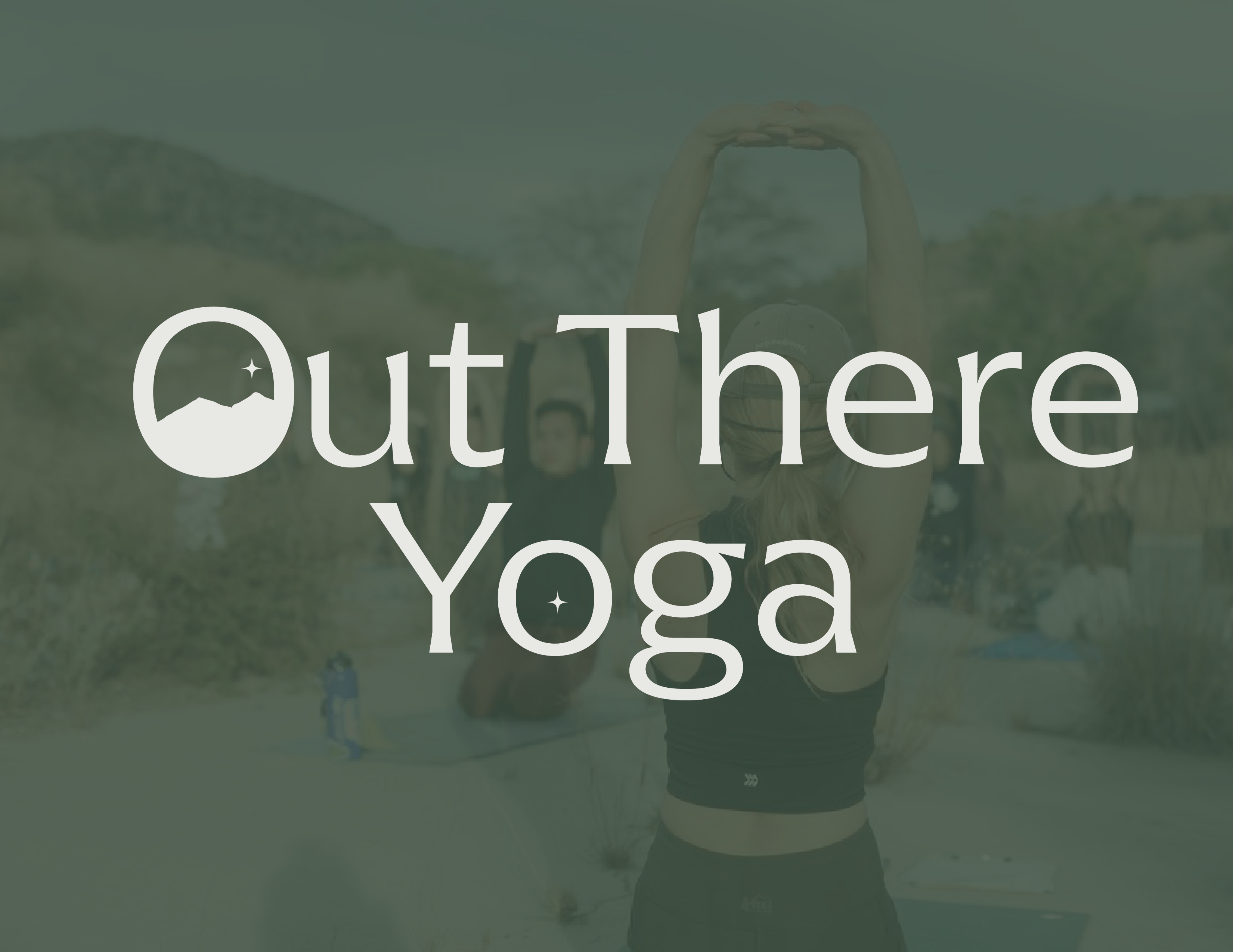
I wanted to include elements from the old logo into the redesign. The idea was to include the circular logo as the "O" in Out There Yoga. I used the original sillouette from the logo and began placing them into different types of O's. Some were more circular and others mor oval.
Rejected Concepts:
I wanted to include elements from the old logo into the redesign. The idea was to include the circular logo as the "O" in Out There Yoga. I used the original sillouette from the logo and began placing them into different types of O's. Some were more circular and others mor oval.

Develop:
Final Logo:

Color Palette:

Mood Board:

Results & Final Thoughts
Result:
The result of the rebrand was a new brand identity complete with logo, icon, color palette, and typography which all align closer to the values of Out There Yoga
Final Thoughts:
This case study was one of the very first rebrands I had ever done, and it was an invaluable learning process for me. It taught me the importance of getting aligned with the client goals and using your expertise to help guide them in the direction they want to go based off of answers from your research. The brand is not simply about pretty colors and cute images, but rather a series of decisions that help bring the brand's vision to life.
See More
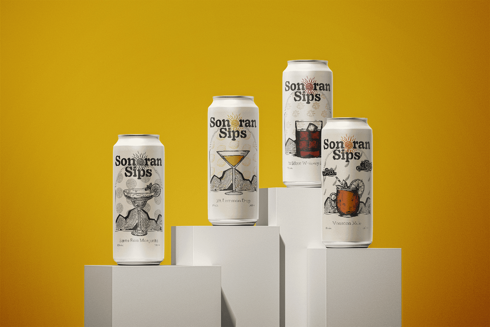
Sonoran Sips
Packaging design for a canned cocktail company
